


GRID MURAL

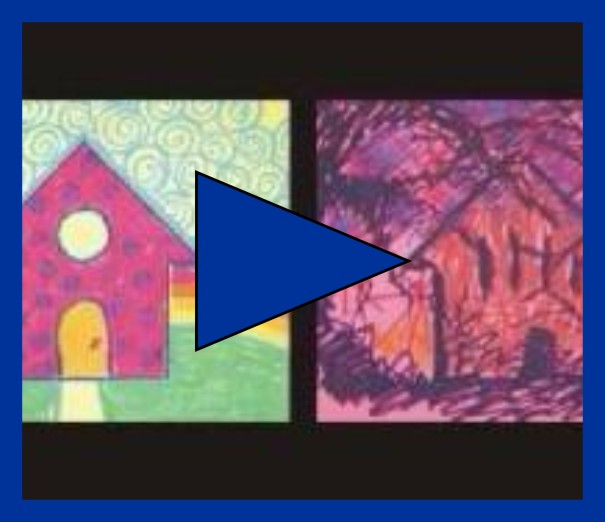
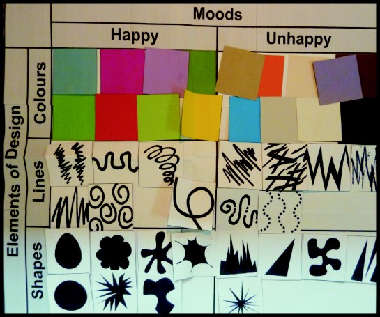
Watch the video entitled "Critical Thinking and Self Expression". As a teacher lead class discussion, sort elements of design into positive and negative groups.
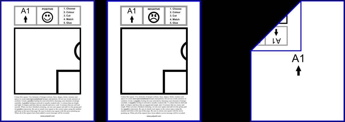
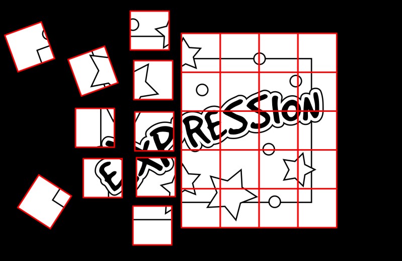
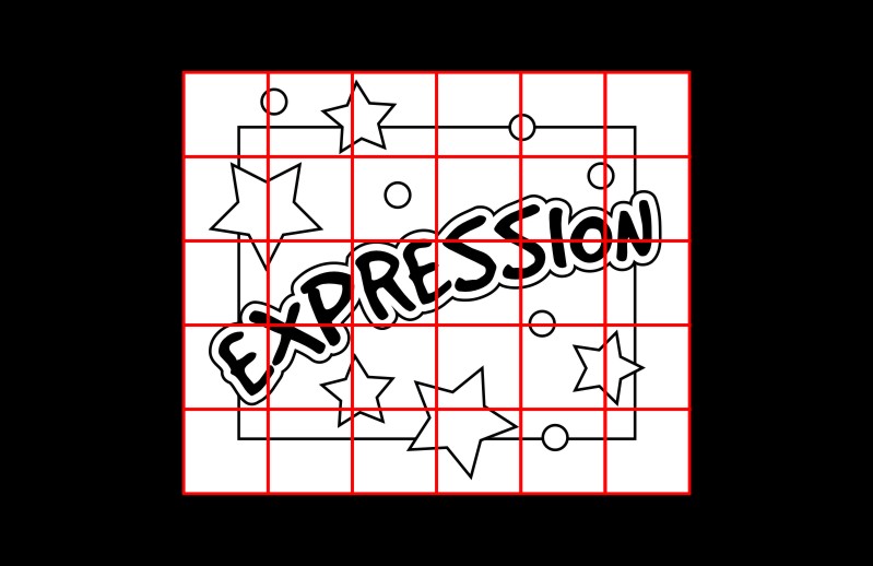
On mural paper, draw two identical grids as shown. Each grid square must be 6 inches by 6 inches. Number the grid squares, as shown.
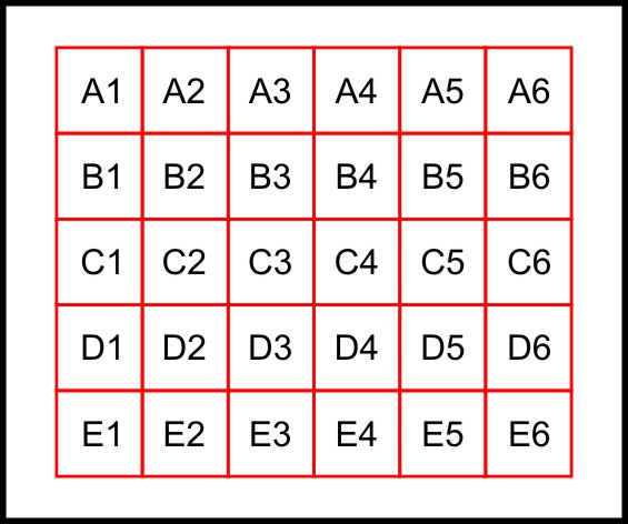
Instructions for POSITIVE grid squares
Instructions for NEGATIVE grid squares
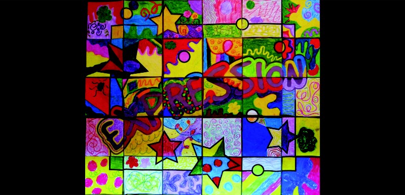
Colour this square. Use elements of design (colours, lines, shapes, forms, textures and space) to create non-representational designs and patterns. Do not use words, pictures or symbols. Create a positive feeling for your artwork by choosing your elements of design carefully. A positive feeling in artwork is usually created with: 1) colours that are bright and light; 2) shapes and lines that are smooth and curvy; and, 3) textures that are soft and smooth. When you have finished colouring, cut out your square and add it to the group grid for positive expression. Be sure to match your square to the correct space using the number and letter at the top of this page. Be sure to orient your square with the arrow pointing up. When all of the squares have been added a secret message will be revealed.
Colour this square. Use elements of design (colours, lines, shapes, forms, textures and space) to create non-representational designs and patterns. Do not use words, pictures or symbols. Create a negative feeling for your artwork by choosing your elements of design carefully. A negative feeling in artwork is usually created with: 1) colours that are dull and dark; 2) shapes and lines that are jagged and rough; and, 3) textures that are coarse and rough. When you have finished colouring, cut out your square and add it to the group grid for negative expression. Be sure to match your square to the correct space using the number and letter at the top of this page. Be sure to orient your square with the arrow pointing up. When all of the squares have been added a secret message will be revealed.

Visual Arts
(A teacher's resource)
